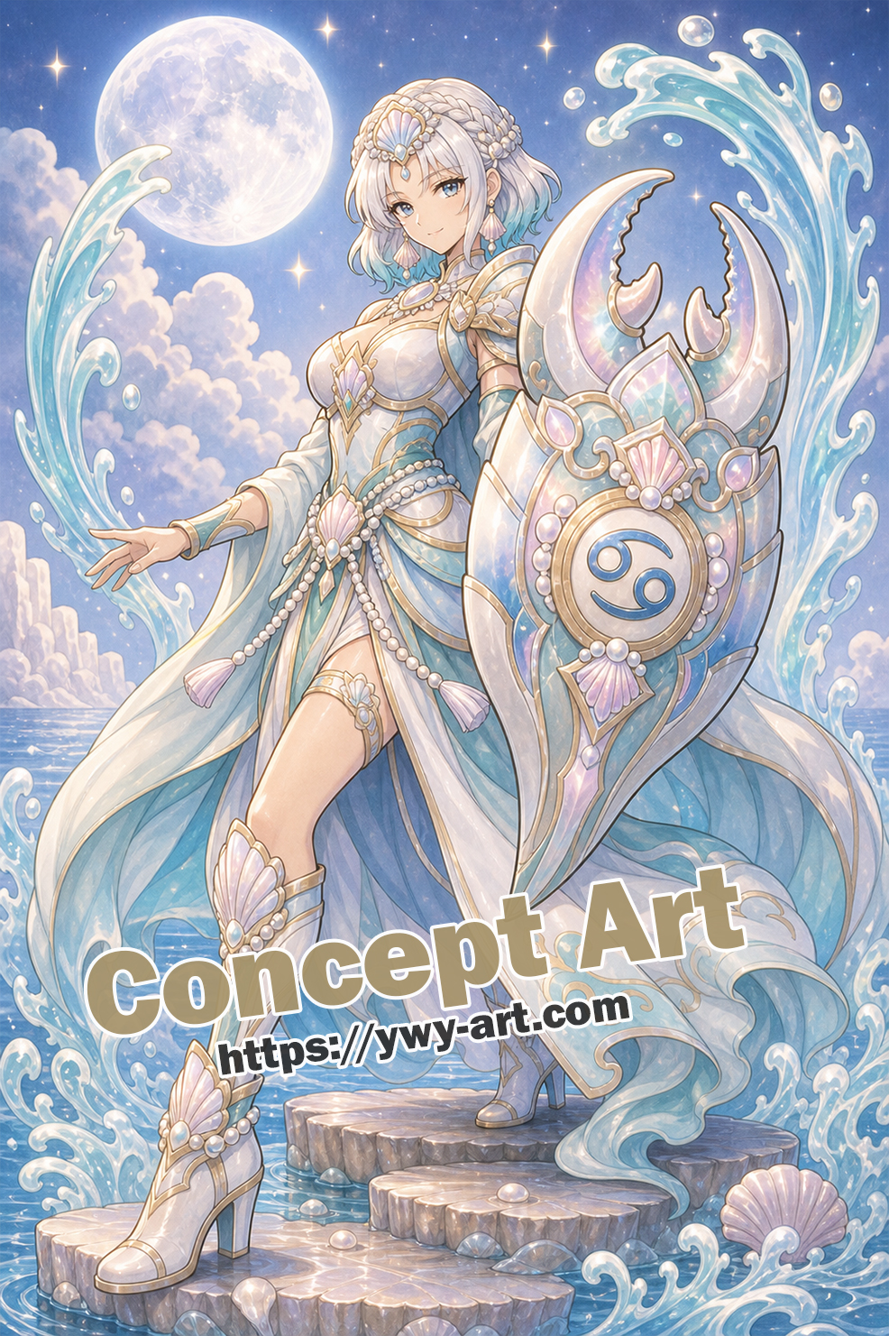
A Shield Pulled from the Tide
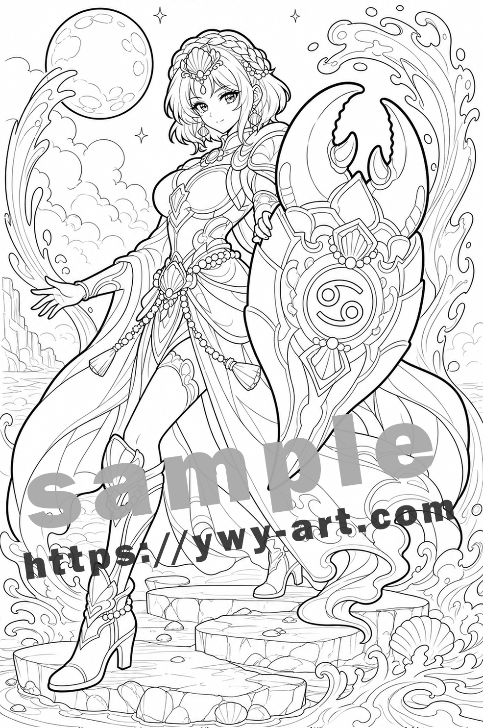
Some zodiac pages want drama. This one keeps a softer hand.
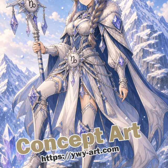
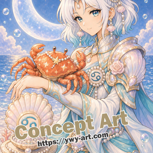
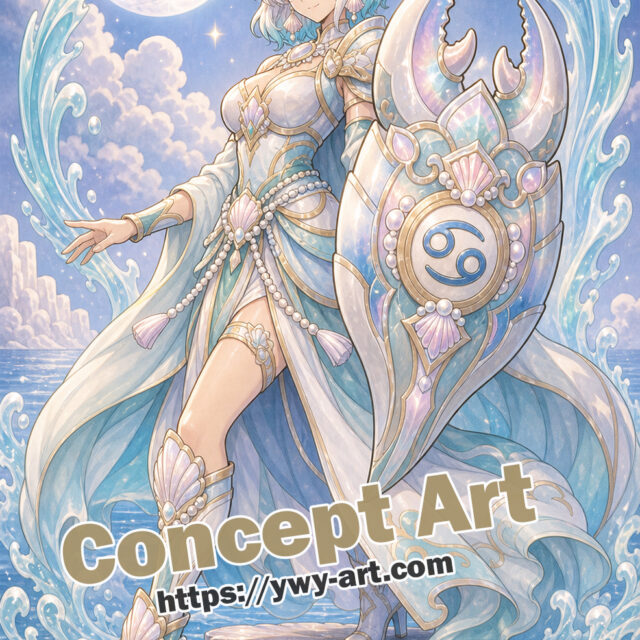
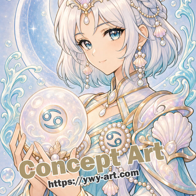
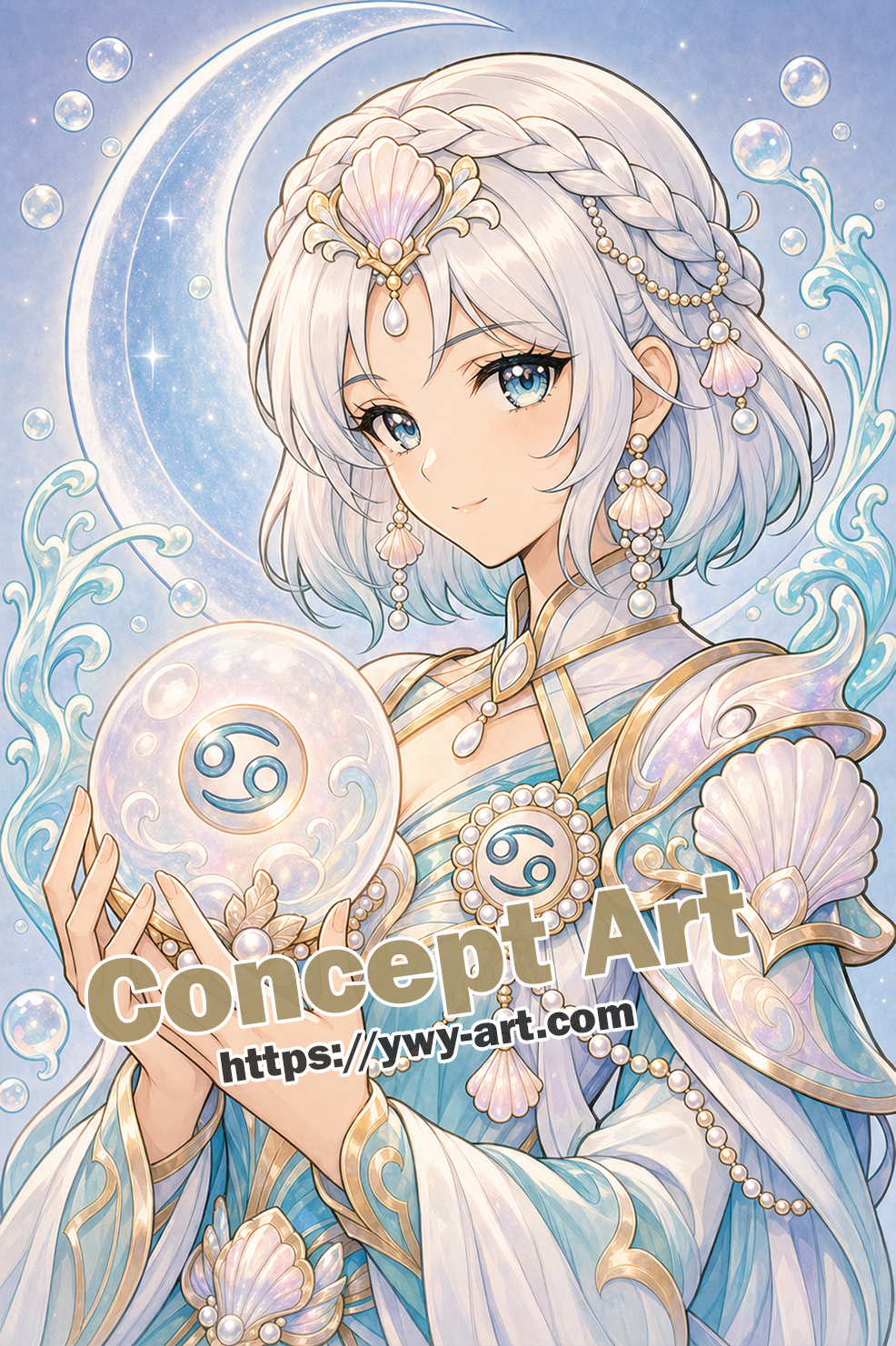
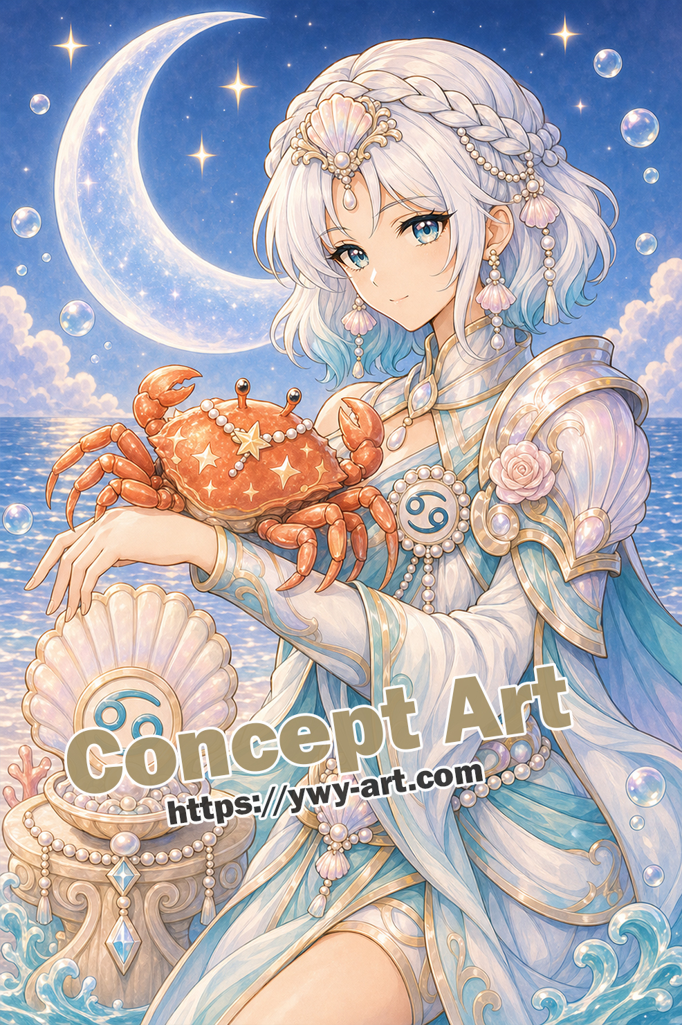
Cancer Tide-Shield Sentinel brings the Cancer guardian theme into a clear anime fantasy coloring page. The main visual hook is the crab-claw shield, with the wave curl adding the sign language in a way that is easy to notice. Around the figure, the scene stays simple: shell steps and two water arcs. That restraint matters. It gives the page a finished fantasy mood, but it also leaves enough breathing room for real coloring, where hands pause, colors change, and not every tiny space needs a perfect plan.
The crab-claw shield gives the guardian a strong shape, while the water arcs keep it flowing.
About the Cancer Myth
Cancer is a small sign in the sky, and its myth can feel small too: the crab sent by Hera during Heracles’ fight with the Hydra. The crab does not win. It is crushed. But Hera still places it among the stars, which gives the story an odd, tender edge.
That is why I did not want Cancer to feel weak. I leaned into shell, moon, pearl, tide, and protection. A crab is not grand in the same way a lion is grand, but it has armor, patience, and a sideways kind of courage.
How the Myth Became This Artwork
In Cancer Tide-Shield Sentinel, I pulled that background into the crab-claw shield, the wave curl, and a simple backdrop: shell steps and two water arcs. The full body layout also matters here. It decides, quietly, whether the myth feels like a portrait, a ritual object, or a small scene someone has walked into.
The shield is the important translation here. The crab’s shell becomes protection. I wanted the page to say that defense can be beautiful too, especially with water moving around it. It is not a strict museum version of the myth, more a coloring-page translation of it.
What Makes the Page Work
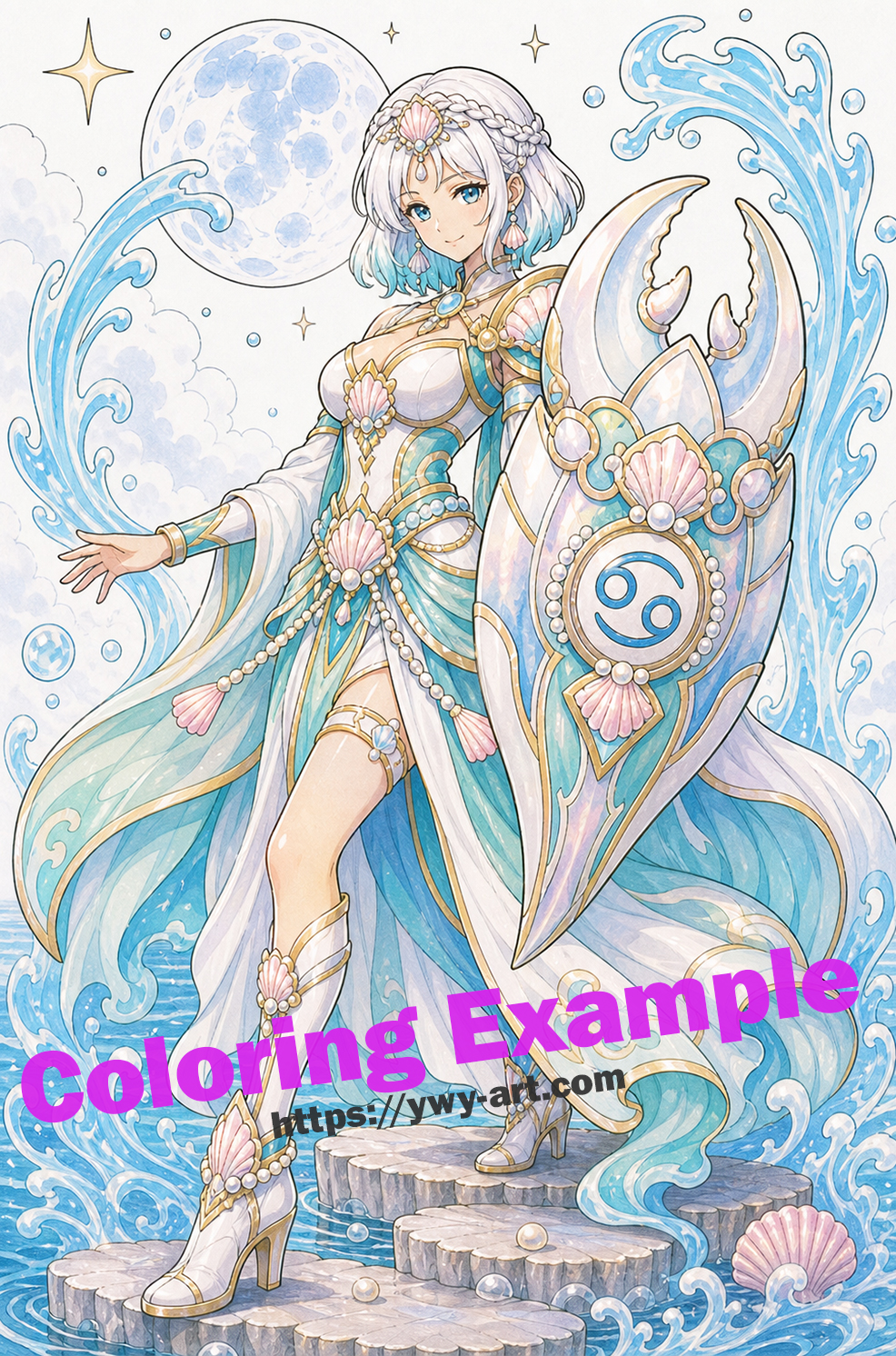
The full-body pose gives the page movement, but the main relic still gives you an easy first decision. The design is a little more involved, but still very manageable, and the zodiac identity is not hidden in tiny decoration.
Cancer pages look best when the whites and pale blues do some of the work; the shell and pearl details do not need to shout.
A Simple Coloring Plan
I would color the shield first, using coral sparingly so it does not fight the blues.
My first palette would be pearl blue, sea glass green, pale violet, with deep blue only near overlaps. I would repeat the main color in three places, not everywhere. That usually makes a page feel more settled.
A Small Coloring Note
Water looks better when some curves are left open. I would not fill every wave.
If the page starts to feel busy, I would leave one background area almost untouched. Paper white is not unfinished; sometimes it is the cleanest highlight on the page.
A Friendly Page for Zodiac Coloring
This is the kind of design where you can color the focal object first and still feel as if you made real progress. The full body layout gives the page its own pace, while the water mood suggests a natural color direction.
Final Thoughts
Cancer Tide-Shield Sentinel is a zodiac guardian page with a clear symbol, a readable fantasy scene, and enough open space to make coloring feel personal.
No need to rush this one.
Step into the world of mythology..
Available on Amazon Anime Zodiac Guardians Coloring Book Open in a new tab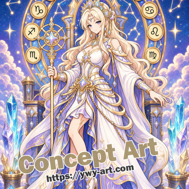



コメント