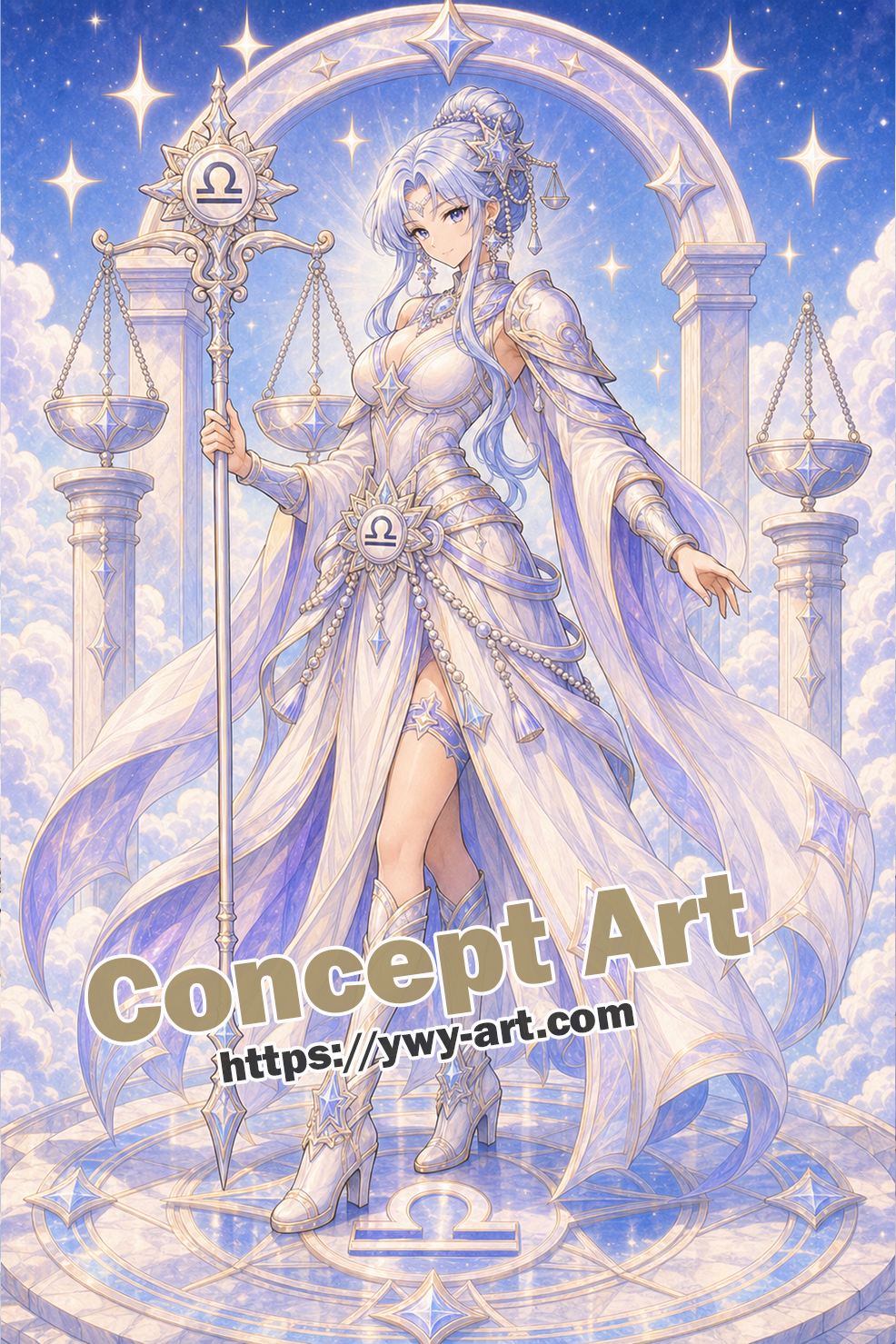
A Temple Scene with Open Air
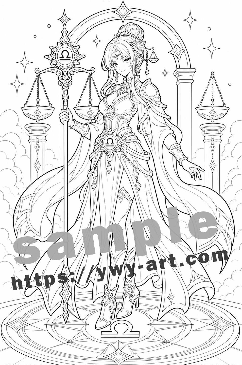
This page has a clear center, which is always a relief when the marker caps come off.
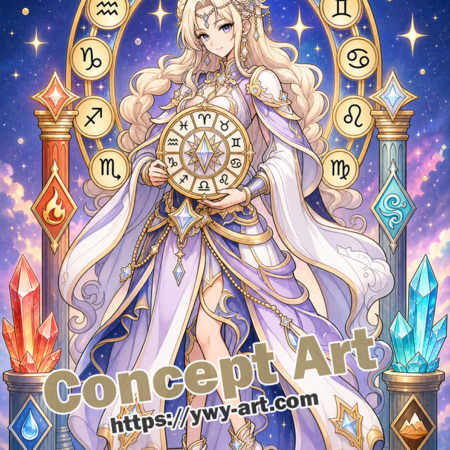
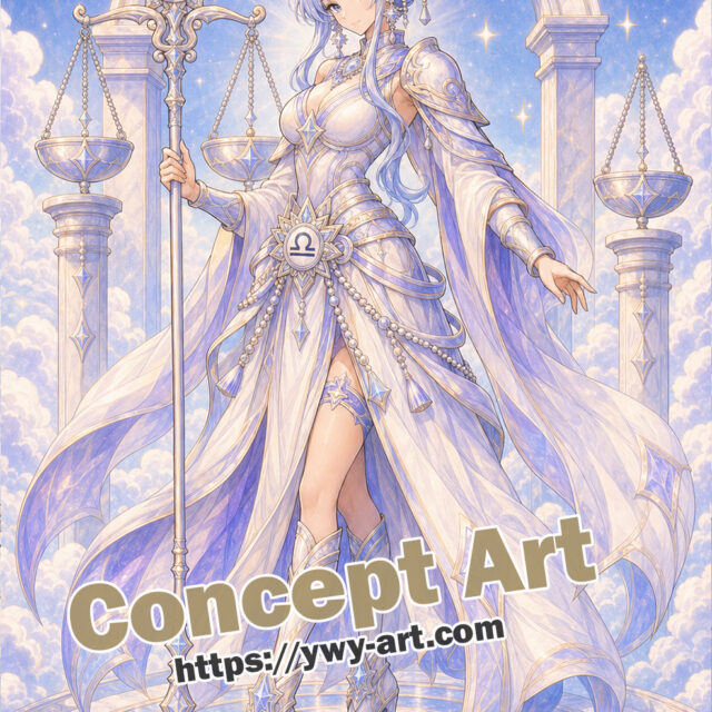
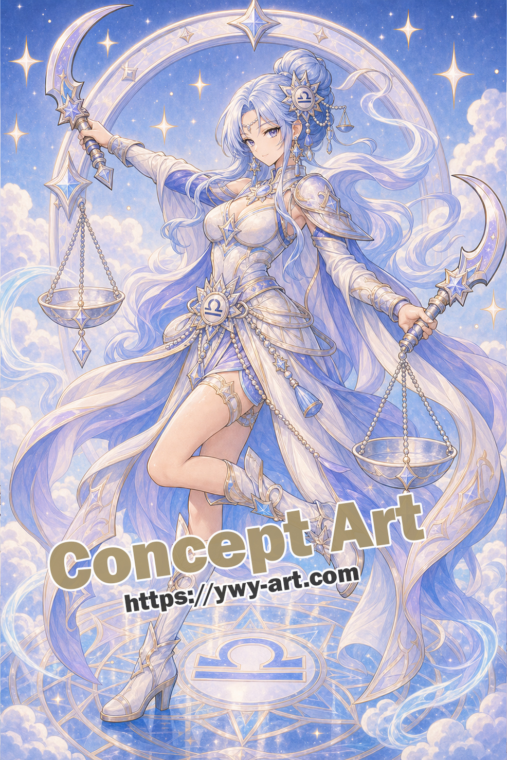
Libra Temple of Balance brings the Libra guardian theme into a clear anime fantasy coloring page. The main visual hook is the central scale staff, with the twin pillars adding the sign language in a way that is easy to notice. Around the figure, the scene stays simple: open temple arch and floating scales. That restraint matters. It gives the page a finished fantasy mood, but it also leaves enough breathing room for real coloring, where hands pause, colors change, and not every tiny space needs a perfect plan.
The twin pillars and central scale staff make the page feel ceremonial but still readable.
About the Libra Myth
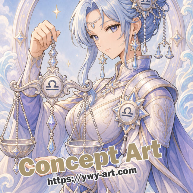
Libra is the scales, and it is often read beside Astraea or Themis, figures of justice and order. What I like is that Libra is not a creature. It is an object, a tool, almost a question: what weighs more, what should be held back, what needs to be evened out?
That made the design feel more ceremonial. I wanted balance to appear in the page structure itself, not just as a tiny glyph in the corner. Pillars, blades, scales, and paired shapes all came from that idea.
How the Myth Became This Artwork
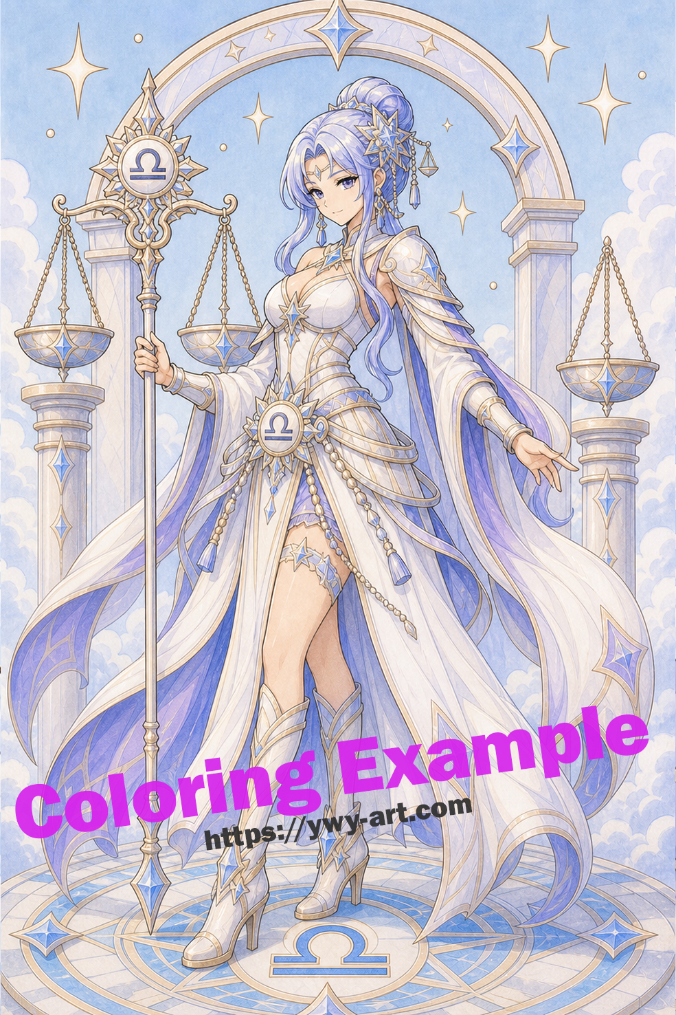
In Libra Temple of Balance, I pulled that background into the central scale staff, the twin pillars, and a simple backdrop: open temple arch and floating scales. The full body layout also matters here. It decides, quietly, whether the myth feels like a portrait, a ritual object, or a small scene someone has walked into.
The temple setting makes Libra feel public and ceremonial. I wanted the viewer to sense a place where balance is practiced, not just displayed. This is the sort of thing I notice only after looking at the page for a minute.
What Makes the Page Work
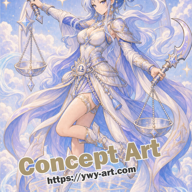
The full-body pose gives the page movement, but the main relic still gives you an easy first decision. The design is a little more involved, but still very manageable, and the zodiac identity is not hidden in tiny decoration.
Libra needs balance in the coloring too, so I would repeat the same accent on both sides of the composition.
How I Would Color This Page
I would keep the pillars pale stone and put the brighter color on the floating scales.
My first palette would be pale aqua, clear sky blue, soft lavender, with silver gray for the quiet parts. I would repeat the main color in three places, not everywhere. That usually makes a page feel more settled.
A Little Lesson from This Page
This is one of those pages where empty air is part of the design. I would protect it.
If the page starts to feel busy, I would leave one background area almost untouched. Paper white is not unfinished; sometimes it is the cleanest highlight on the page.
A Friendly Page for Zodiac Coloring
This is the kind of design where you can color the focal object first and still feel as if you made real progress. The full body layout gives the page its own pace, while the air mood suggests a natural color direction.
Final Thoughts
Libra Temple of Balance is a zodiac guardian page with a clear symbol, a readable fantasy scene, and enough open space to make coloring feel personal.
No need to rush this one.
Step into the world of mythology..
Available on Amazon Anime Zodiac Guardians Coloring Book Open in a new tab











コメント