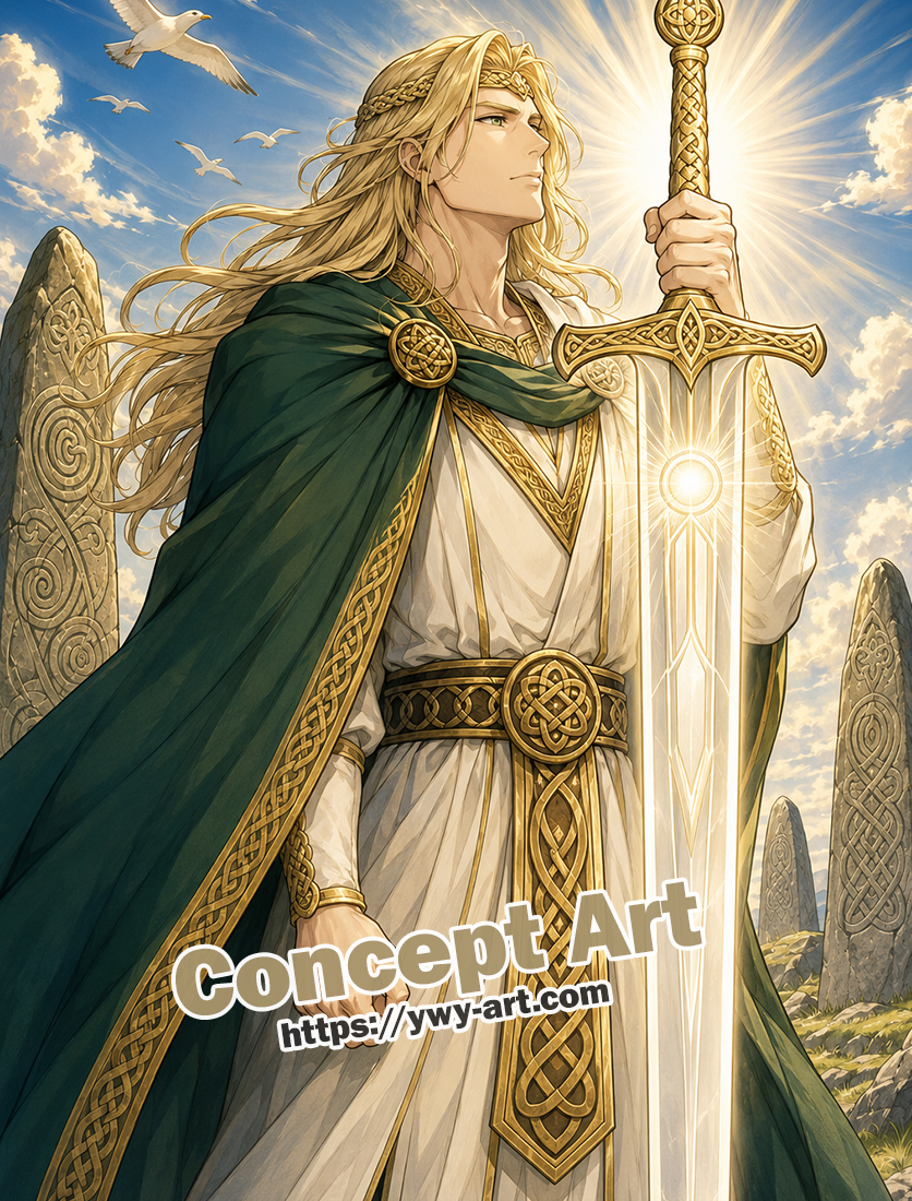
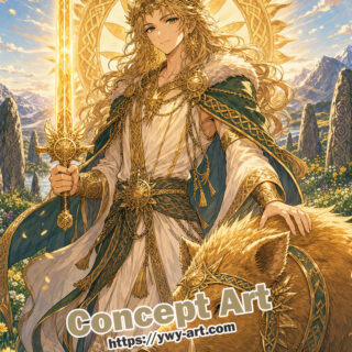
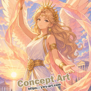
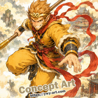
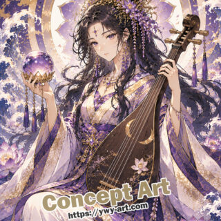
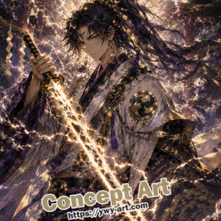
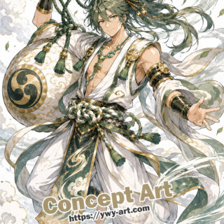
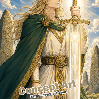
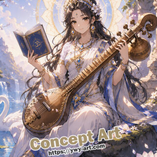
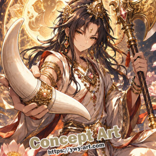
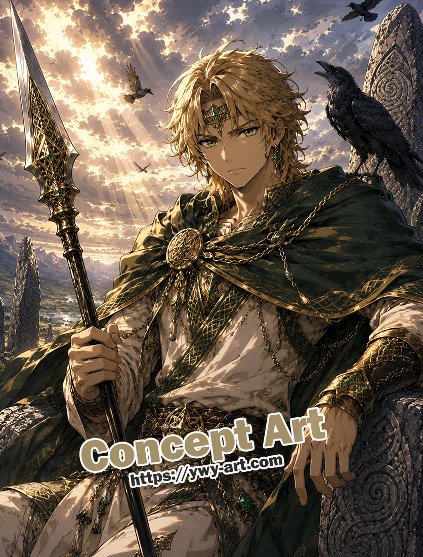
Nuada and the Sword of Light – A Bright Celtic Relic Among Standing Stones
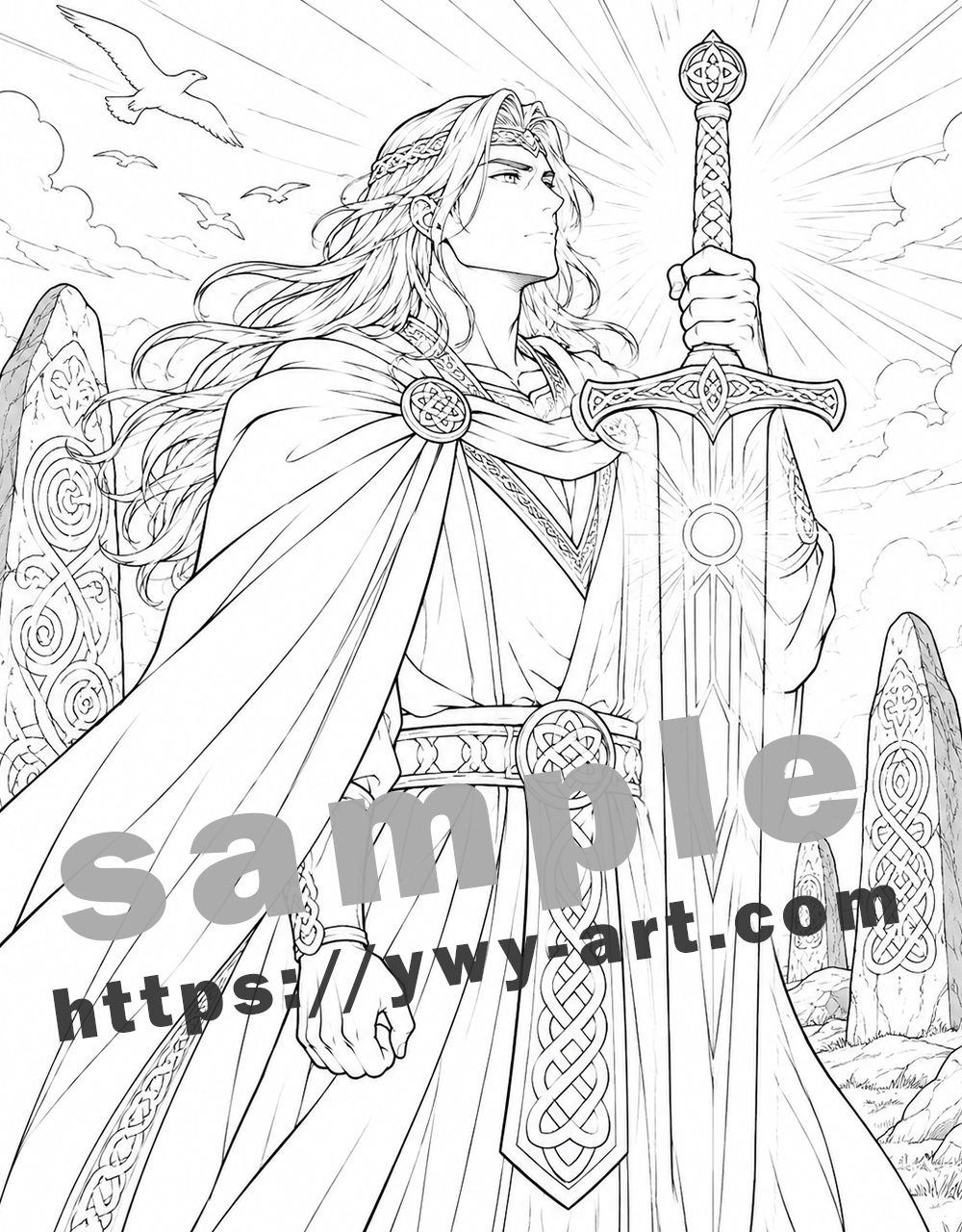
This Nuada page from Anime Gods and Mythic Relics Coloring Book feels like the brighter counterpart to the Lugh artwork. It still has Celtic standing stones, knotwork, long hair, and a green cloak, but the mood is more open and radiant. Nuada stands beneath a wide blue sky, holding the Sword of Light upright as rays burst from behind the blade. The whole page has a clean, heroic feeling.
What stands out immediately is the sword. It is not just held in the scene; it becomes the source of the page’s energy. The bright circle at the center of the blade, the long vertical lines, and the sunburst behind the hilt all point toward the idea of divine illumination. This is a page where the coloring plan should begin with light.
Who Is Nuada?
Nuada is a kingly figure from Irish mythology, often connected with the Tuatha De Danann. He is famously associated with kingship, battle, restoration, and the legendary Sword of Light. In many retellings, this sword is one of the great treasures of the Tuatha De Danann, a weapon that represents authority and unstoppable brightness.
In this artwork, Nuada does not look aggressive. His pose is upright and formal, almost ceremonial. He looks beyond the viewer, toward the light, while the sword rises in front of him. That gives the page a noble and almost sacred feeling, rather than a simple action-scene mood.
The Sword of Light
The Sword of Light is the heart of this coloring page. The blade is large, clear, and vertical, with a glowing circle near the upper center. In the line art, there are many straight rays radiating outward behind the sword, so even before color is added, the page already tells you where the light should come from.
I would color the sword with a very restrained palette: pale gold, ivory, soft yellow, and maybe a hint of warm white if using gel pen or paint pen. The blade should feel luminous, not heavy. Avoid filling it with flat gray unless you want a colder steel version. For this page, a glowing sacred blade will suit the artwork better.
The hilt and guard can be richer gold, with small darker shadows inside the knotwork. This contrast helps the blade stay bright while the handle feels solid and crafted.
Looking at the Artwork
The composition is beautifully simple. Nuada’s body forms a tall vertical shape, the sword repeats that vertical line, and the standing stones echo it in the background. The cloak flows strongly to the left, which gives movement to an otherwise still pose. Birds in the sky add air and openness.
The large green cloak is one of the biggest color areas. It can become very beautiful if shaded gradually, but it can also become too heavy if colored as one dark block. The robe underneath is mostly light, which helps the sword glow. This page depends on contrast between green, white, gold, and sky blue.
The standing stones are detailed enough to be interesting, but they should stay secondary. Their spirals and Celtic knot carvings connect the scene to Nuada’s ornamented belt and sword hilt, but the brightest color should remain on the Sword of Light.
A Palette I Would Try
- Sword blade: ivory, pale yellow, soft gold, and white highlights.
- Sword hilt: warm gold, antique gold, ochre shadows, and small bronze details.
- Cloak: forest green, deep emerald, olive shadows, and gold trim.
- Tunic: warm white, cream, pale beige, and light gray folds.
- Hair: golden blond, honey, pale yellow highlights, and light brown shadows.
- Standing stones: weathered gray, beige-gray, moss green, and blue-gray shadows.
- Sky: clear blue, soft cloud gray, cream light, and pale yellow around the rays.
- Birds: white, light gray, or soft cream so they stay airy.
Planning the Light First
This is one of those pages where it helps to decide the light source before coloring anything else. The sword and sky rays are clearly meant to glow. If you color the surrounding areas too dark too early, the glow may feel pasted on rather than natural.
I would start by leaving the sword blade mostly white. Add pale yellow near the glowing circle and along the inner lines. Then lightly shade the areas closest to the sword with warm cream or soft gold: the hand, the front of the tunic, the belt, and the inside edge of the cloak. This makes the light feel like it is touching the figure.
The sky rays can be pale yellow near the sword and fade into blue. You do not need to color every ray strongly. Some can remain almost white, which will make the glow feel brighter.
Coloring the Cloak and Tunic
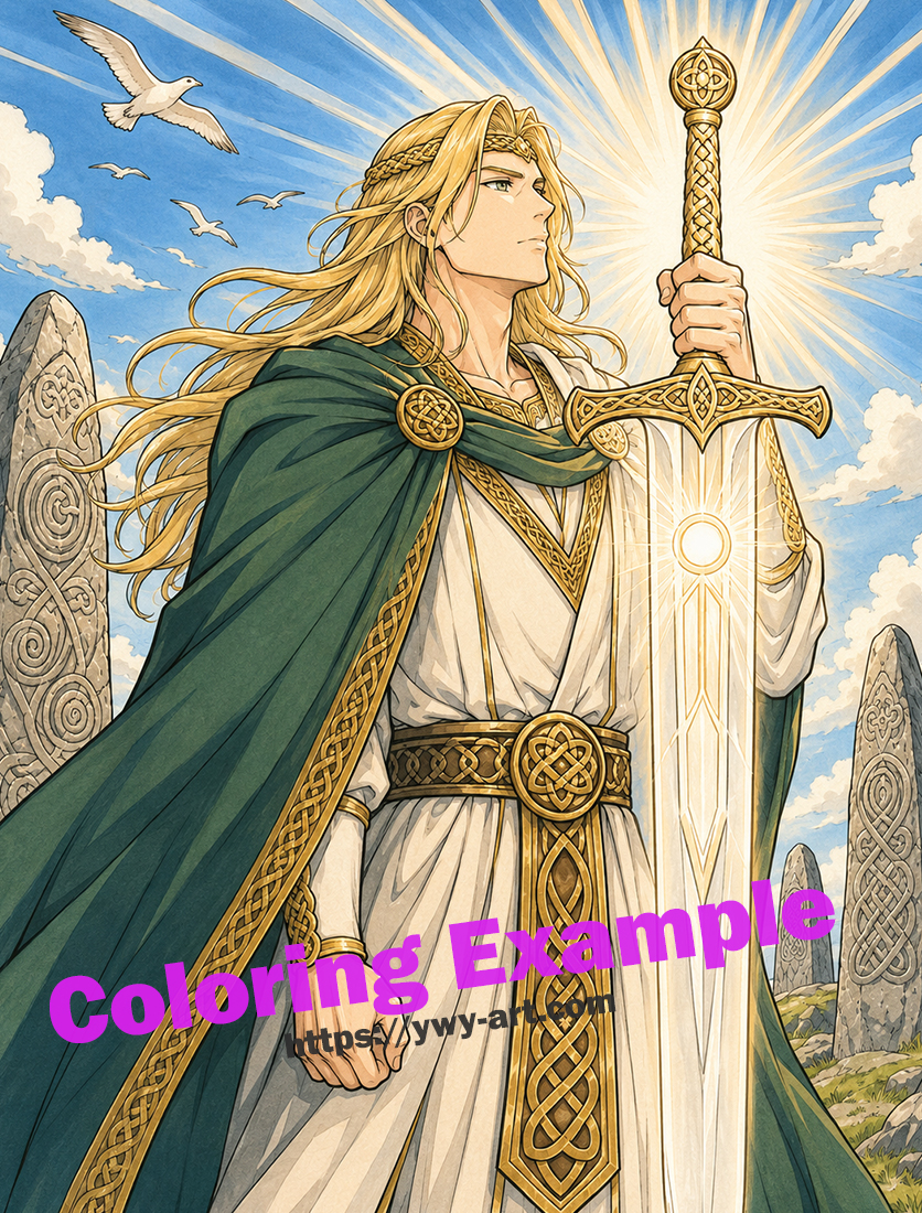
The cloak is a deep green in the color reference, and that works very well. Green gives the page a Celtic landscape feeling and sets off the gold beautifully. Use darker green in the folds and under the shoulder, but leave lighter green along the edges closest to the sword light.
The tunic should stay mostly light. Cream, ivory, and pale warm gray will give it shape without taking attention away from the sword. If the tunic becomes too yellow, it may blend into the gold details. A little gray-blue shadow in the deeper folds can help separate the fabric from the glowing blade.
The belt and trim are a good place for more detailed coloring. The knotwork can be antique gold with darker brown lines inside the pattern. Just be careful not to make every tiny knot equally bright; the main shine belongs to the sword.
Working with the Standing Stones
The standing stones give the page its ancient setting. They should feel weathered, carved, and slightly rough. Start with a light gray or beige-gray base, then add darker gray along one side and inside the carved grooves. A touch of moss green near the base can make them feel rooted in the landscape.
The stone on the left is large and close to the figure, so it can have a little more detail. The stones on the right and in the distance should be softer. This helps create depth and keeps the foreground clear.
What to Be Careful With
The biggest risk is making the sword too dark. A “Sword of Light” should feel luminous. Even if you use metallic gold, leave enough pale areas so the blade shines. The glow circle can be the brightest point on the page.
Also be careful with the sunburst. If every ray is outlined or colored with equal intensity, it may look stiff. Let some rays be stronger and others softer. Light is more convincing when it has variation.
The green cloak can become heavy if over-shaded. Keep highlights along the folds and trim, especially near the upper body and left edge where the light would catch the fabric.
Final Note
Nuada’s Sword of Light page is a clean and noble Celtic-inspired artwork. It has standing stones, knotwork, birds, a sweeping cloak, and a divine sword that turns the whole page toward brightness. Compared with darker underworld or storm pages, this one feels clear, elevated, and ceremonial.
If I were coloring this page, I would keep the sword nearly white-gold, use deep green for the cloak, warm ivory for the tunic, weathered gray for the stones, and bright blue for the sky. The finished page should feel like sunlight breaking through ancient myth, with the Sword of Light shining at the center of everything.
Step into the world of mythology..
Available on Amazon Anime Gods and Mythic Relics Coloring Book Open in a new tab


コメント